Packaging of Tianfu Jinnan Red Wine
天府金南红酒包装
PROJECTPackaging of Tianfu Jinnan Red Wine
CLIENT CHENGDU 成都
SERVICECREATIVE PACKAGING DESIGN / PRODUCTION 包装 / 产品
DATE 2018-06
MORE THAN WINE
「天府金南」作为一个高端美国红酒运营品牌,专为高层次的品质客户服务。品牌从每个细节角度都让用户感受到非凡的品质红酒生活方式,以及对精致生活的坚持。

从一开始提出logo设计升级需求,再到包装设计,从前期的沟通到后期的落地,项目几乎一气呵成,无论是效果还是品牌质感。好的开始让我们双方建立了“去甲方化”的合作模式,我们也成为品牌的一部分去为品牌深度提供设计服务,与客户一起打造一个更具专业感的品牌形象。

从logo与VI设计上,我们定位于美式的ART DECO风格,符合典型美式华丽视觉表现的设计特征,logo 图形结合“TFJN”的字母组合,将风格元素巧妙地与字母图形特征拆分融合,形成图形标。整体色彩以黑金为主,彰显品牌气质。整体视觉语言简洁大气,富有质感。

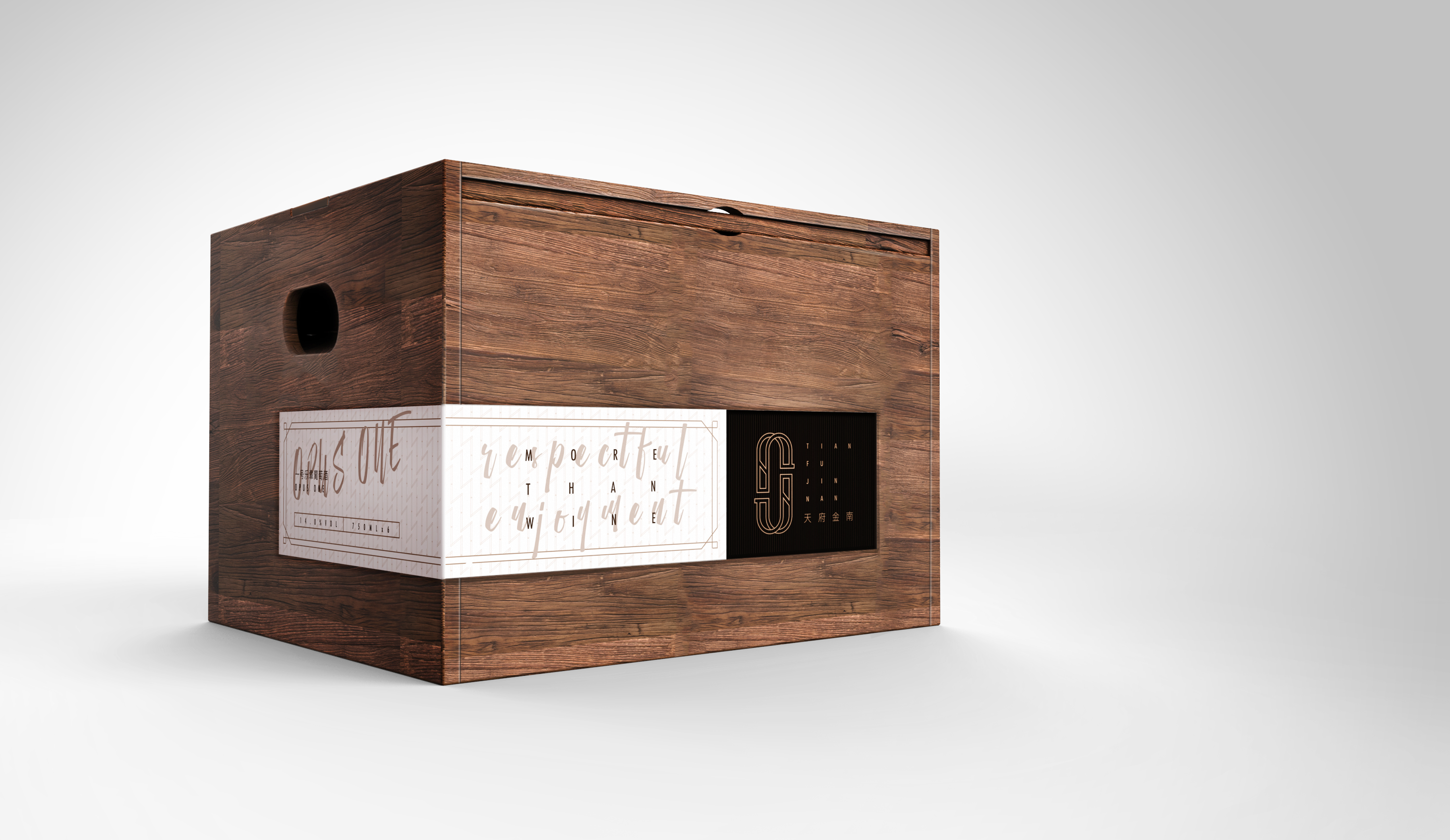
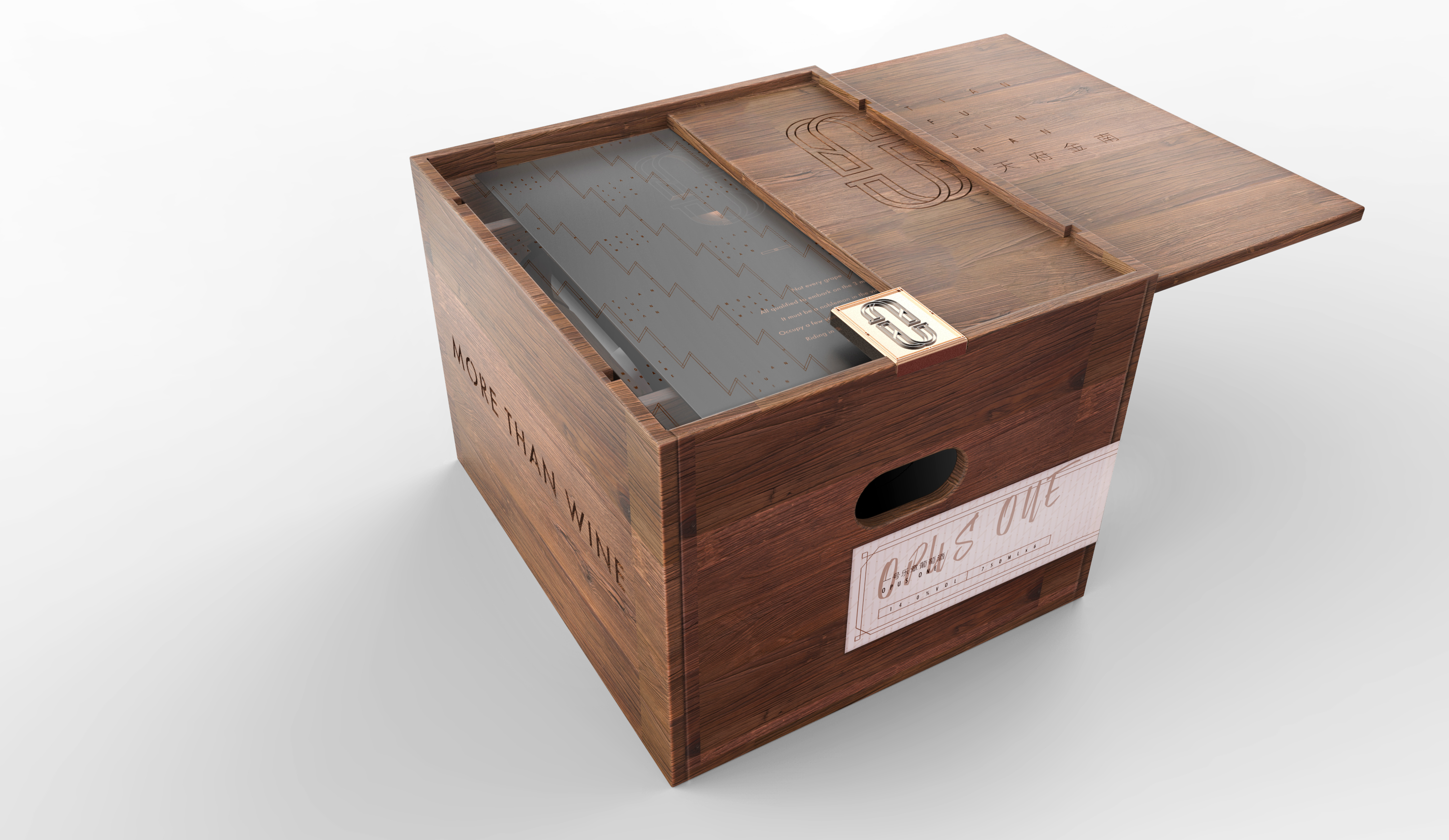
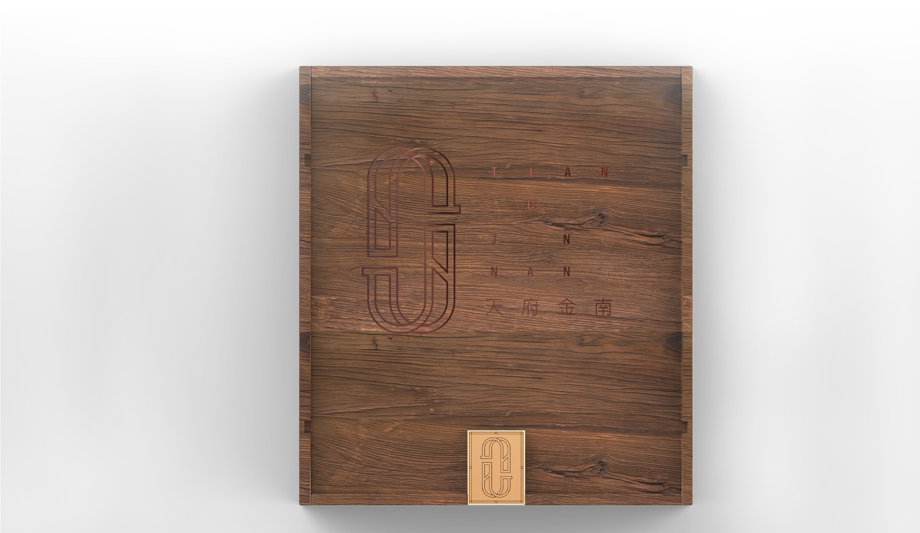
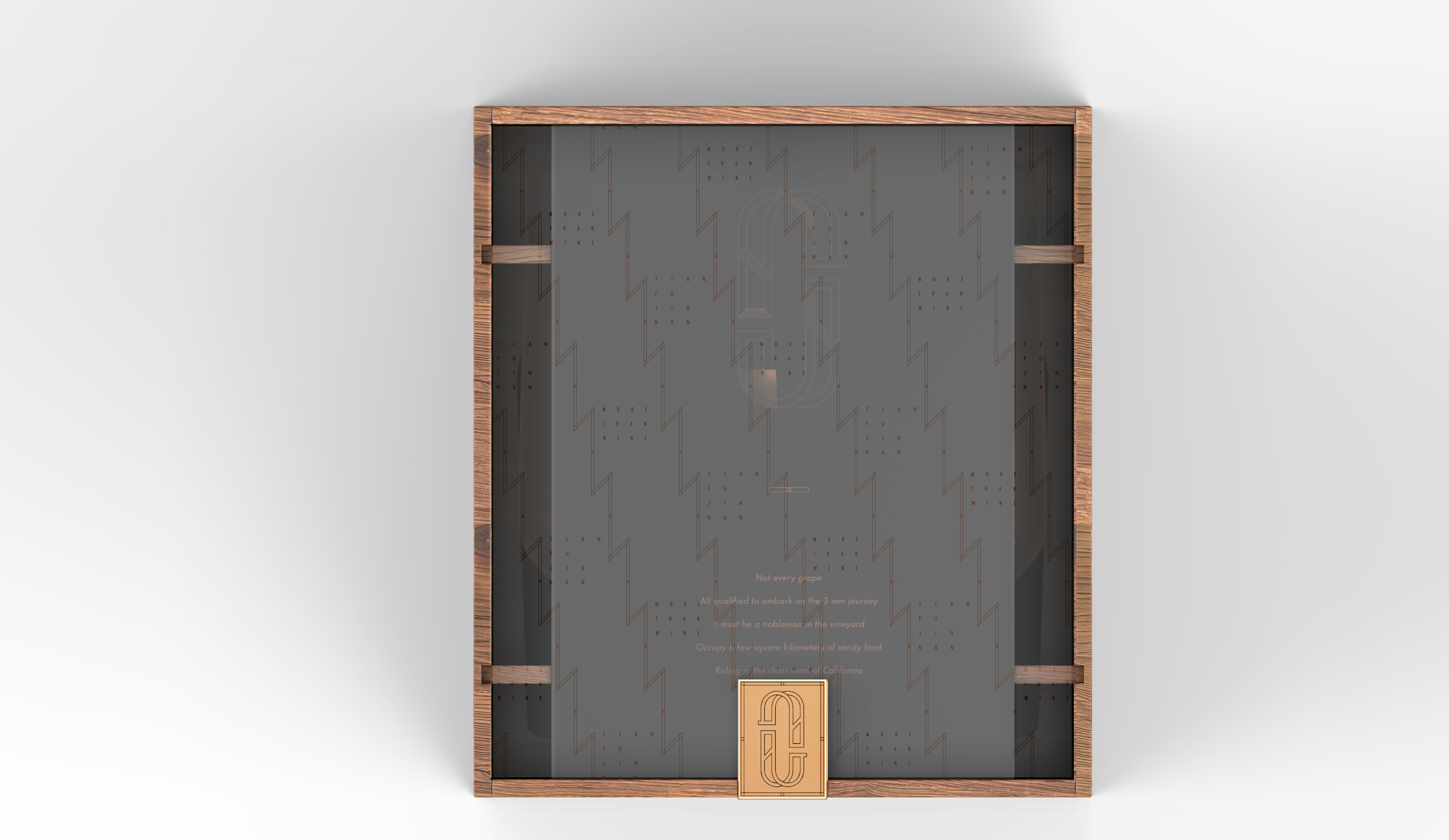
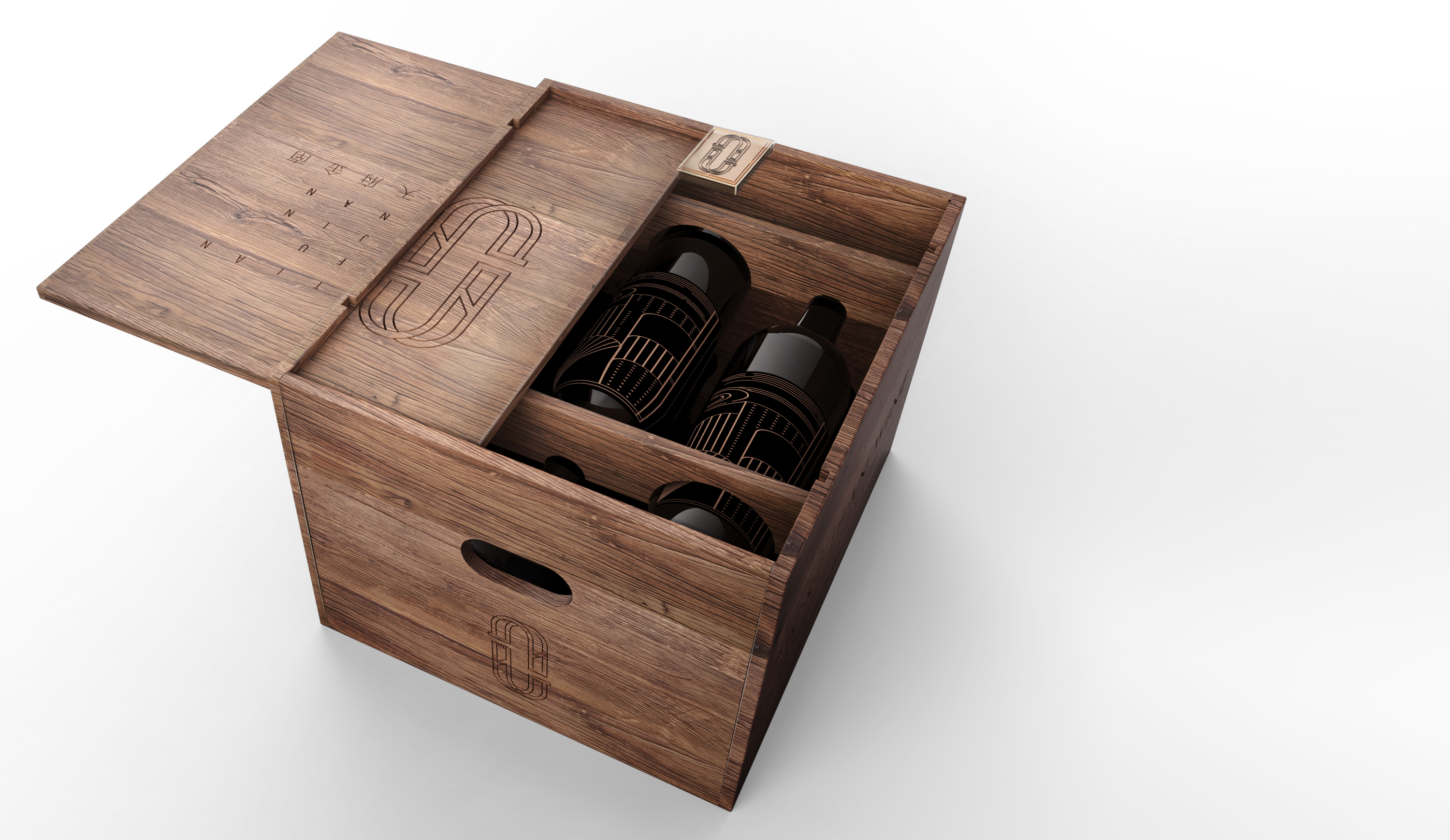
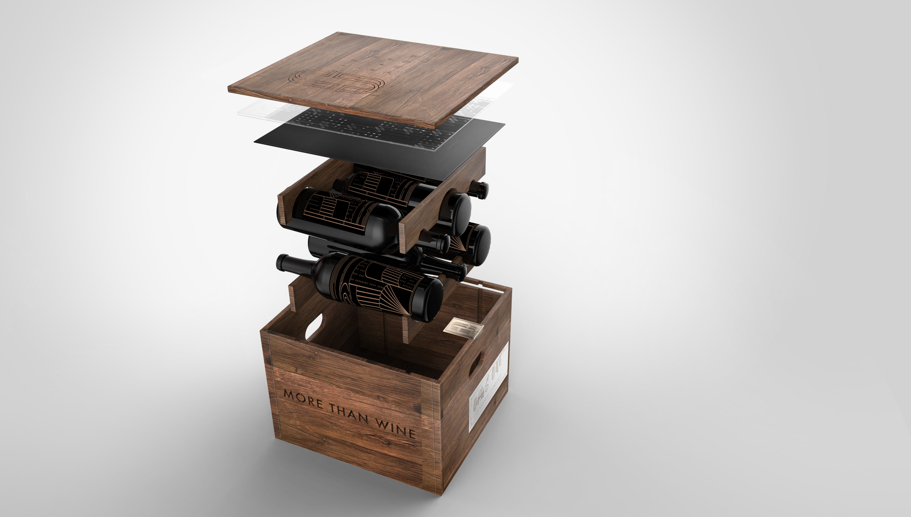
在六只装红酒包装设计上,我们选择更能体现红酒品牌基因的原木材质,结合侧面抽拉的开启方式。顶部的LOGO金属铭牌象征着红酒沉淀的历史感。侧面,贴以能方便手写红酒品类的特种纸,用手作的温度增加品牌的温暖。

在面对消费选择的众多的今天,我们力求为品牌在同质化共性的市场下脱颖而出,用视觉语言传递出品牌对品质坚持的声音。
[Tian Fu Jin Nan], a high-end American red wine brand that is targeted at high-end quality customers, pays close attention to details so as to provide its users with superb red wine and advocate the delicate life.
The project runs smooth in the whole process ranging from the need for logo design upgrade to packaging design and from early communication to implementation of later period, and has achieved both desired results and temperament. Such smooth progress enables us to establish a "de-party A" cooperation model, by which we are allowed to advance the brand design and create a more professional brand image jointly with customers.
In terms of the logo and VI design, we follow the American ART DECO style typical of American gorgeous visual design. By combining the letters "TFJN" with the logo, the graphic logo is formed. The dominant tone is black and gold, which can well reveal the noble temperament of the brand. The overall visual design is concise and offers one a decorous feeling. The log that can highlight the noble temperament of the brand is used for the package of the red wine of the drawer-type six-bottle pack which can be drawn from its side. The metal nameplate of the LOGO on the top symbolizes the deep-rooted history of red wine. The side of the package is pasted with specialty paper on which hand-written specialties of red wine can be made, a quite humanized design of the brand.
READ MORE
